The first photo is "repulsive" because people often percieve thorns as being ugly. However, it is interesting that although this picture depicts something that is stereotypically associated with repulsiveness, I think that the photo is actually quite attractive. This photo also lies under the "repulsive" category because of the colors. The majority of the photo is with brown shades, which are often not as attractive as bright colors. This picture also shows balance because the green buds on the thorn bush are unified with the green grass in the background. The rule of thirds is demonstrated because the focal point is on the branch on the right side of the picture, making the photo split into three parts. The picture on the right shows moldy/algae infested bricks. While this is initially repulsive, I also think that this photo is still attractive. I like how space was created because the bricks get smaller and fuzzier as they appear to be farther away. I also like how lines between the bricks create a rectangular pattern. The main colors of the photo that makes it "repulsive" are greys, browns, and greens. However, these supposedly "ugly" colors allows for a dominant focal point in the bottom the picture (the reddish orange brick). This area obtains the most emphasis because the color of this brick is opposite on the color wheel from the greenish colors of the rest of the photo.
Wednesday, April 29, 2009
Repulsive
The first photo is "repulsive" because people often percieve thorns as being ugly. However, it is interesting that although this picture depicts something that is stereotypically associated with repulsiveness, I think that the photo is actually quite attractive. This photo also lies under the "repulsive" category because of the colors. The majority of the photo is with brown shades, which are often not as attractive as bright colors. This picture also shows balance because the green buds on the thorn bush are unified with the green grass in the background. The rule of thirds is demonstrated because the focal point is on the branch on the right side of the picture, making the photo split into three parts. The picture on the right shows moldy/algae infested bricks. While this is initially repulsive, I also think that this photo is still attractive. I like how space was created because the bricks get smaller and fuzzier as they appear to be farther away. I also like how lines between the bricks create a rectangular pattern. The main colors of the photo that makes it "repulsive" are greys, browns, and greens. However, these supposedly "ugly" colors allows for a dominant focal point in the bottom the picture (the reddish orange brick). This area obtains the most emphasis because the color of this brick is opposite on the color wheel from the greenish colors of the rest of the photo.
Tuesday, April 28, 2009
Jan Saudek
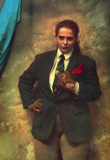
One of the common themes among Jan Saudek's photography were images of women. I think that she had the idea that women were oppressed or viewed in a stereotypical manner. Many of her pictures depict women in the nude and appear to be submissive to men or are shown to be sad or depressed. She combines the elements of repulsiveness and attractiveness in the majority of her photos in order to convey her point to the viewers. In the pictures above, for example, an "ugly" brown tint is used in the background and throughout the entire photo. Many of her photos appear to be aging or are slightly demolished in order to show society's crumbling opinion of women. However, Saudek's pictures remain beautiful at the same time because she adds pops of vibrant colors or has beautiful models within the photo. In the photo on the left, Saudek uses a woman model. However, one of the key features of this image is the fact that the woman is wearing men's clothes and is holding a baseball mitt, which represents a masculine sport. It is apparent by the look on the woman's face that she is questioning of this setup and may be slightly laughing to herself at the atrociousness of this concept. The photo on the right is an image of an innocent, beautiful young girl. She appears to be dressed up as an older woman and perhaps is showing a patch of skin on her shoulder in order to please men in her society. There are many more photos that convey Saudek's disdain for men's perception of women, but these images are much more sexually explicit. They often show a man being dominant over a woman.
Thursday, April 23, 2009
Montage- "In Full Bloom"
This montage deals with the themes of ideas, self-perception, and personal growth. The focal point of the picture is on the burst of sunlight coming from behind the model's head. This patch of light reminds me of a lightbulb over a person's head when they come up with a new idea, only in this picture it could represent various bright ideas bursting from the model's creative mind. I also purposely placed a picture of the model jumping with joy behind her, because this could possibly be a glimpse into her mind. The tunnel reveals the depth of her thoughts and the fact that she is jumping may convey a sense of self confidence. The flowers along the edge of the montage relate to a person's idea or mind blooming, growing, and maturing. The flowers are unified with the background of palm tree branches that spread across the ground in the picture and spread across the model's shirt. The vibrance of the colors in the work of art convey the mood of happiness that come with developing one's ideas and making progress in the categories of self esteem and personal growth.
Montage- "Dream"
The themes of this montage were the ideas of dreaming and curiosity. I think that the expression on my model's face conveys a feeling of contemplation. The clouds in the background of the montage also add a sense of one's mind "floating on a cloud" while thinking or day dreaming. I added the various sea creatures to the montage in order to bring a sense of randomness and to show that dreams don't have to make complete sense in order to be important. The theme of sea creatures also helps unify the piece because they fit in with the picture of the ocean in the background. I made the montage monochromatic with various shades of blue. The darkest and most intense blue resides in the model's face, making her the focal point of the piece. I wanted to draw people's eyes first to the expression that she carries on her face, which gives the work a sense of curiosity. Many times people, when thinking of color psychology, believe that blue often conveys a gloomy sad feeling. However, I think that by using blue in this montage, it helps bring a sense of calmness that is often associated with dreaming. I think that it was important to create a work of art about a state of peace, because too often our society is extremely fast paced and doesn't allow people to stop for a moment and contemplate various aspects of their life.
Tuesday, April 7, 2009
Subscribe to:
Posts (Atom)